Trade gaps visualized through motion and mass

Trade gaps visualized through motion and mass
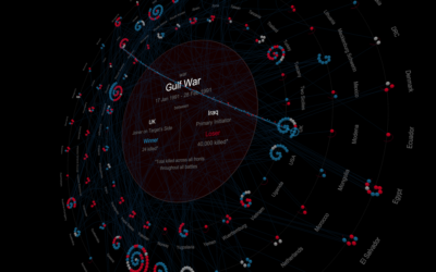
A visual history of interstate conflicts

Africa is growing, Europe is dying: Net birth-death rates across nations

The Tragedy of US School Mass Shootings
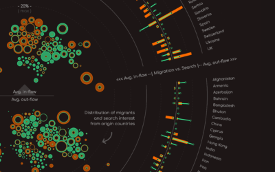
A visual exploration of the gap between the reality of world’s migrants and search interest.
The Angry Face of Nature.
In the last few years Mohamad Waked has emerged as a most promising and creative visualization designer. His approach is unique, combining the journalistic, the illustrative, and the automated and programmatic. His projects merge handcrafted drawings with intricate graphs, charts, and maps, woven into narratives about topics both important or lighthearted. Having developed a project with Mohamad, I can also say that he’s a pleasure to work with.
Mohamad consistently demonstrates he is a data visualisation designer and developer of the highest calibre. His work always thrills me with its imaginative aesthetics, smart technical execution and, most of all, the fact it is always analytically useful. He delivers the form and the function, and that’s so important!
Mohamad has proven again and again that he can bring data and beauty together to shine a light on immensely important topics. His unique style and perspective is a gift to the data visualization community and beyond.
In tech, we call unicorns those with a broad skill set. Mohamad Waked is, without a doubt, one of these rare specimens. He creates and designs stunning visualizations, brings them to life with code, and makes them relatable with delightful storytelling. And most importantly, his professionalism makes being in contact with him always a pleasure.
I became aware of Mohamad Waked’s work through Alberto Cairo’s The Art of Insight book project. We’re “chapter neighbors” in the book, and I immediately started reading his chapter and became interested in learning more about his work. I love how Mohamad balances storytelling with data visualization. His work addressing the migrant crisis, The Unwelcomed, is haunting and solemn at the same time. You can clearly see that Mohamad has built upon his career progression—from mechanical design engineer to data scientist to data visualization designer to data journalist. Make sure to check out his portfolio.

MALOFIEJ AWARDS | 2020

THE PUDDING CUP | 2020

CENTER FOR GLOBAL DATA VISUALIZATION CHALLENGE | 2019