A VISUAL EXPLORATION of the gap BETWEEN the REALITY OF WORLD'S MIGRANTS AND SEARCH INTEREST.
In Migration between Search and Reality; the viewer can explore the migration interest on Google to move to or from different world countries and compare this with the reality of the world’s migrants based on the United Nations (International Migrant Stock) data for the period 2005-2020. Some interesting trends have been revealed for many of the world’s countries. This dataviz-driven exploration takes you through some of the most interesting insights found in the data for some of selected countries in different interactive visuals and let you explore your country or any other country among 173 countries on the list.
One out of every 30 people in the world is a migrant.
The number of international migrants grew to 281 million in 2020, meaning that 3.6% of the world’s people lived outside their country of birth that year, according to the United Nations’ International Organization for Migration (IOM).
Parallel worlds for migrants
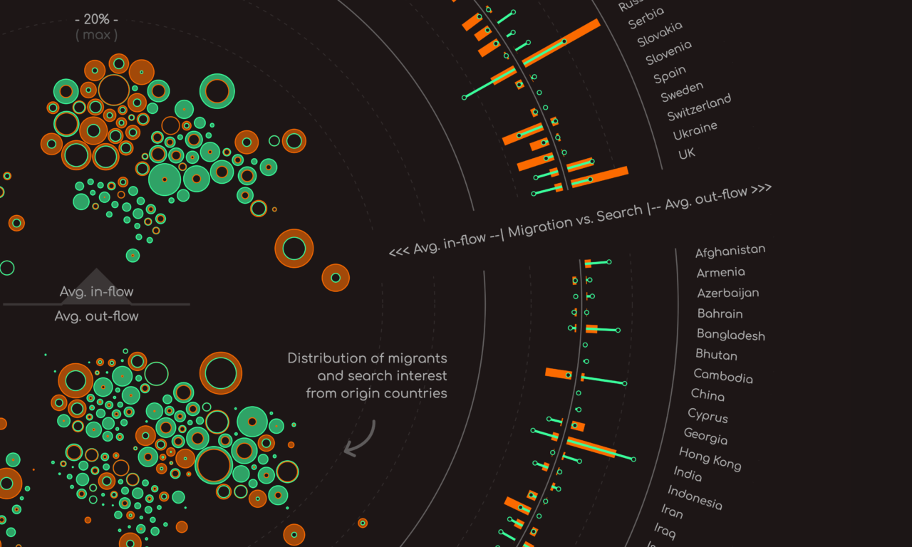
Google search data has reaveled another different stories about migration’s interest to or from different world’s countries.
MIGRANTS' DREAMS AGAINST THEIR REALITY
Fly by yourself, explore the data, and see the gap between the real world of migration and the virtual world drawn that was created by their interests and desires.
The Story behind the story
This project started in 2022 when I received an invitation from Alberto Cairo to collaborate with him and Simon Rogers to work on a data visualization project for Google News Lab using Google search data as a base.
Two things excited me to directly -without any hesitation- accept the invitation. The first is working directly with two of the best mentors in this field, the second is the freedom to propose whatever is interesting to me.
Out of a few proposed ideas, we all were interested in answering this big question about the gap between the reality of the world’s migrants and their dreams and desires which is reflected somehow in their google search interests. Comparing data between this real world and that virtual world would be magical to achieve.
The project started with some challenges in collecting this massive Google trends dataset but successfully we finished this part using variations of common search queries that have been translated into different languages to capture the most accurate results. Now, we would be able to compare this search interest results against the world migration data that has been sourced from the United Nations (International Migrant Stock) data.
Preparing, normalizing and analyzing the two datasets wasn’t that easy. I can honestly say it is the most challenging data collecting, cleaning and analysis project I have ever worked on. But day after day, I had a clear understanding of the data attributes and a better vision on how this complicated data could be visualized and presented.
Some initial design concepts have been drafted and tested. Then it went through different iterations until it reached the current final design and shape that got the acceptance of Alberto and Simon. The design of data Visualization is intended to take the viewer on a learning curve from more straight forward bar charts and stacked area charts to more complicated designs for “the bigger picture” circular interactive chart.
The narrative of the story started by focusing on two of the most noticeable countries. One is a continuous origin of migrants for decades and the other is a dream destination for many migrants from different countries. Then it shines the light on four of the most desired countries in four different regions of the world. And ends up by letting the viewer see the complete picture of the two worlds all together and explore more stories by himself.

Explore it!
I hope you enjoy exploring this project the same way I did while working on it.
Client
Tools
- R
- D3.js
- Adobe Illustrator
- Procreate
FEATURED ON
- The Plot, 2023.
- Global Investigative Journalism Network, 2023.
- Dataviz Inspiration, 2023.
- Infogr8, 2023.